There is a lot of work going on towards the Rally for a frack free Ryedale on 25th April in Malton. I am very behind with making the banners and placards but think I'll manage to get them all done next week. Plus cakes, always we have cake!

.jpg)
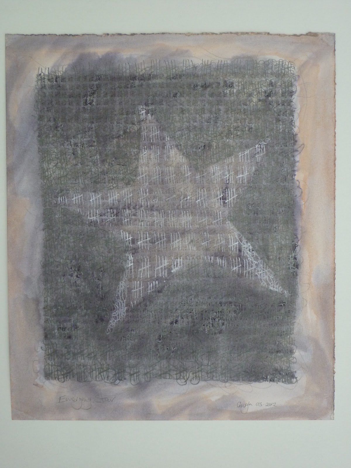
My entry can be found here: http://www.nyos.org.uk/Artists-Makers.aspx?&fR=64&nR=114
My studio has been very neglected so far this year; I have managed to reorganise and tidy it ready for when I have time to get out there and make work. At least it is ready for North Yorkshire Open Studios. I am really looking forward to it this year because Jenny Pepper http://www.jennypepper.com/ is opening her studio up as well, so it will make our venue really worth visiting with two artists on site and of course, cake!
I am feeling a bit desperate about studio work; missing the routine of it, especially as this was going to be the year where I concentrate on that as my major activity. Unfortunately my work with Frack Free Ryedale and Frack Free Kirby Misperton has taken up lots of time, energy and head space, which leaves me in the wrong frame of mind for my own work. Still, once the rally is over I hope to be able to concentrate again.

From this:
Studio clear up, from the left over chaos of last year to a reorganised space ready for work and NYOS 15.
To this!

I have finally taken the plunge and having a series of works on paper reproduced using giclee printing. As a rule, I don't like doing this but these twelve pieces make up one work and to sell one of the originals would destroy it. Therefor I am very excited to say that thanks to Ian Mitchell's recommendation, http://www.ianmitchellart.com/, I am happy to be working with Norton Print and Frame, http://www.fineart.co.uk/directory/fruit-art-ltd_100032.aspx?DirectorySearchPageId=5, who are excellent. I will be going to check the proofs on Tuesday and then will give the go ahead for a limited print run of each.
The series, called Laminar Flow, is one that was made as an experiment; I wanted to try and express what each season feels like and how they form a whole cycle and to do this, I made twelve pieces, acrylic on paper. Each painting started out the same or as near the same as hand made paintings can be, and then each successive painting had one more layer added, equally as identical as I could make them. The twelfth painting is therefor much thicker and heavier than the last. There is one painting for each month of the year; my concerns about the passing of time and memory reflected in each. These were made a few years ago, have been in a local pub for a year and generally forgotten about until I had them home again and realised that they were too good to be stuck on the storage rack. I'd be happy to sell the piece as a whole but devastated to break them up, hence the giclees.
Here is April:
%2BApril.jpg)
My plan is to have one or two complete set of prints for sale packaged in archive boxes and then the others available as individual prints. I may even have packs of cards made, but not sure yet.
Please feel free to leave a comment, I hope you enjoy reading my blog.
All rights reserved.


.jpg)
.jpg)